
Condense with dense!
I have spent a fair bit of time dealing with systems around calender information. Being visually clear for users is really key for them – get the interface out of the way of the information!
So, operating with timelines is a big thing. The ability to know the relationship of things happening is good to represent visually. Do these events overlap? Can I fit something here? What if these things were adjusted?
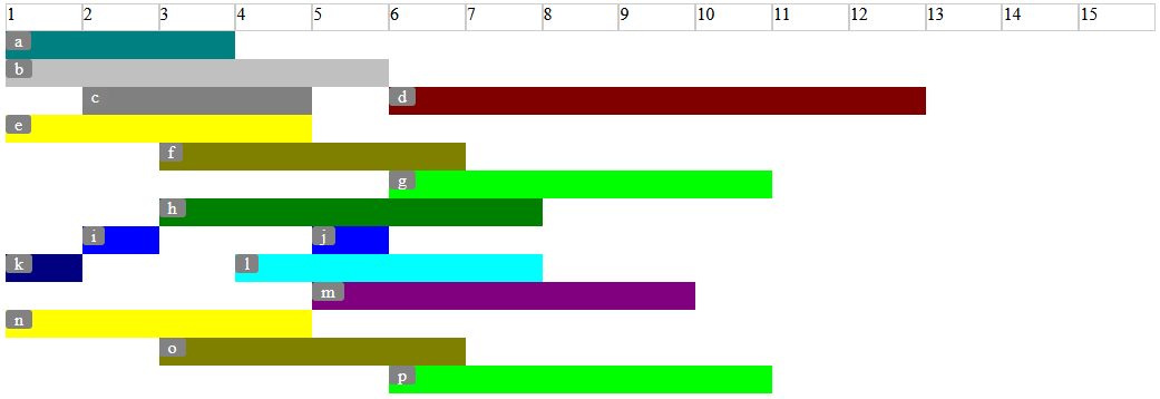
So CSS Grid to the rescue – this is a great improvement on using tables etc.
But we can go further – the grid above is not really optimal. There is a lot of whitespace, and for large datasets this can result in a lot of info being hidden “below the fold”.
So I have been experimenting – based on Jen Simmons work – with using dense to optimise the rows of a given grid:
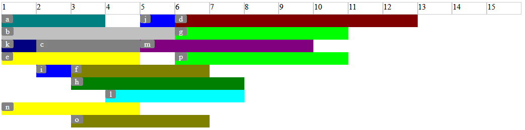
The dense keyword:
grid-auto-flow: row denseThis works to “fill the gaps” in the timeline data. Early experiments on adding and removing nodes seem to work well, suggesting an ability for users to be able to interact with the info.
Have a look at the JSFiddle here, and enjoy the dense!
